Learn Technicals: Types of Charts
- Finquity+

- May 9, 2020
- 3 min read
Hello readers,
this one is for the ones aspiring to excel in Technical Analysis (TA), we begin our guidance for you from the very basics.
As we wrote in the previous blog TA is all about grabbing the trend and price movements and hence, the importance of charts. Charts can be referred to as the heart of Technical analysis.
Types of charts
Candlestick Chart
Heikin-Ashi Chart
Line Chart
Bar Chart
1) Candlestick Chart
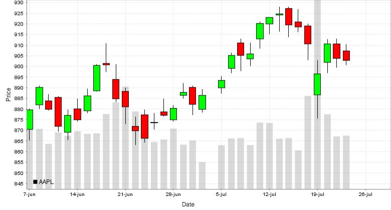
This is the most used chart pattern to analyze the stocks, price movements, and entry-exit points. Multiple candle patterns, chart patterns, indicators, and tools are used for analysis.
Example:

The candles of the chart record the price movements and form bullish or bearish chart patterns. The charts of various time periods are used for analysis. Some of the widely used timeframes are
- Monthly
- Weekly
- Daily
- Hourly
- 30 Minutes
- 15 Minutes
The timeframes indicate price movement of the particular security in the specified time i.e. In the monthly chart each candle refers to the price movement of the month and in the 15 min. chart each candle shows the movement made by the stock in15 mins.
Candles
There are 2 types of candles, we will refer to it as GREEN CANDLE and RED CANDLE
GREEN CANDLE

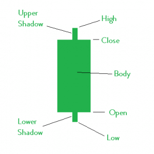
The figure here is quite self-explanatory.
The Green Candle also referred to as Bullish Candle indicates a positive move. The closing price is higher than the opening price.
The body is the difference between the opening and closing price and shadows also known as wicks indicate the highest and lowest price traded during that candle. Wicks are very important in technical analysis as they indicate the sentiments of the market.
RED CANDLE

The Red Candle also referred to as Bearish Candle indicates a negative move. The opening price is higher than that of the opening price.
The body is the difference between the opening and closing price and shadows also known as wicks indicate the highest and lowest price traded during that candle the same as above.
SUBTYPES OF GREEN AND RED CANDLE
Doji Candlestick indicates confusion in the market with regards to the price of the security. Doji Candles have high wicks and thin body which says that the script made significant highs and lows from the open and, closed again near the opening price. This shows a clear confusion.
Hammers are usually considered a bullish and positive sign. as we can see from the candle, high is almost equal to the open/close price while there is a significant wick with respect to the low. The movement says that security went to the lower price level and gave a quick recovery i.e. a clear rejection from the lower price level and Mr. Market is not willing to trade the security at such low levels.
Inverted hammers are exactly opposite to the hammers and indicate weak sign from the market i.e. the script tried to trade at higher levels but Mr. Market rejected it and dragged the price downwards in the very same candle
There's a lot more to Candlestick Charts like candle patterns, chart patterns, indicators, etc. which will be explained in upcoming blogs. For now, we shall stop here and take an overview of other types of charts.
2) Heikin-Ashi Chart
'Heikin-Ashi' is a Japanese trading chart meaning 'Average-bar'.
This chart is derived from the Candlestick chart and the candles in this type of chart are made up through a mathematical formula applied to the Open-High-Low-close points of Candles of Candlestick charts.
Open = (open of previous bar + close of previous bar)/2
Close = (open + high + low + close)/4
High = the maximum value from the high, open, or close of the current period
Low = the minimum value from the low, open, or close of the current period
Heikin-Ashi shows the consistency of rises/falls and is used by traders by adding up moving averages to the charts.
The following images show a difference between the two charts:


3) Line chart
Line charts are formed by connecting the closing prices of the particular script for a given period of time. It gives an aerial view and a clear indicator of the trend of the asset.
Many traders first take a look at this chart for the aerial view to decide whether it is worth investing their time further on the particular security. Following is the example of line chart:

4) Bar Chart
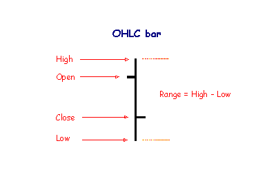
The bar chart is the one similar to the Candlestick chart where candles are replaced by the bars.

A bar shows the high price for the period at the top and the lowest price at the bottom of the bar. Small lines on either side of the vertical bar serve to mark the opening and closing prices. The opening price is marked by a small tick to the left of the bar; the closing price is shown by a similar tick to the right of the bar.

While the Candlestick Chart is the most used chart, some analysts use the Bar Charts to suit their comfort in the analysis.
Stay tuned for a detailed study on Candlestick Charts!


Comments